
Briefing
Create a new visual identity for Roundnet Castores, a Brazilian Roundnet team formed by Erik Hirata and Vitor Tatsuo.
“Castores” means “beavers” in Portuguese, the native language of the team.
“Castores” means “beavers” in Portuguese, the native language of the team.
About Roundnet Castores
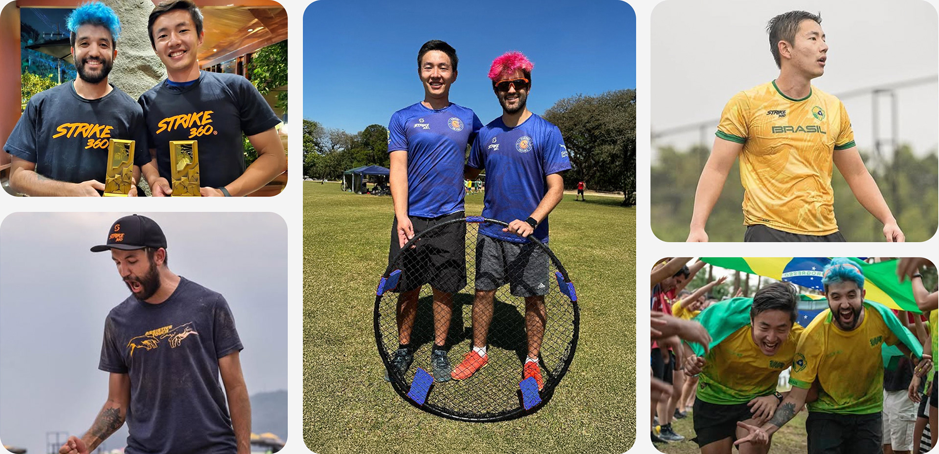
Founded in 2019, the duo is one of the main promoters of the sport in Brazil. They have participated in several national and international tournaments, winning numerous titles, including Latin-American Championship.
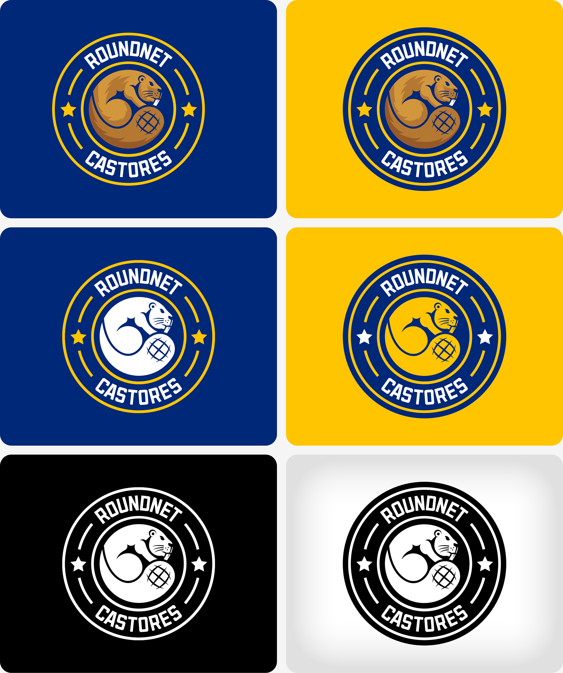
The importance of redesigning the Roundnet Castores logo lies in the need to establish themselves as the leading reference in the sport in Brazil. The duo also requested the use of blue and yellow, as these are the colors of the Scout Group where they met.
Visual Identity Kickoff
The creative process started with visual research. I gathered references to define the project's tone and created two moodboards to guide the visual direction.
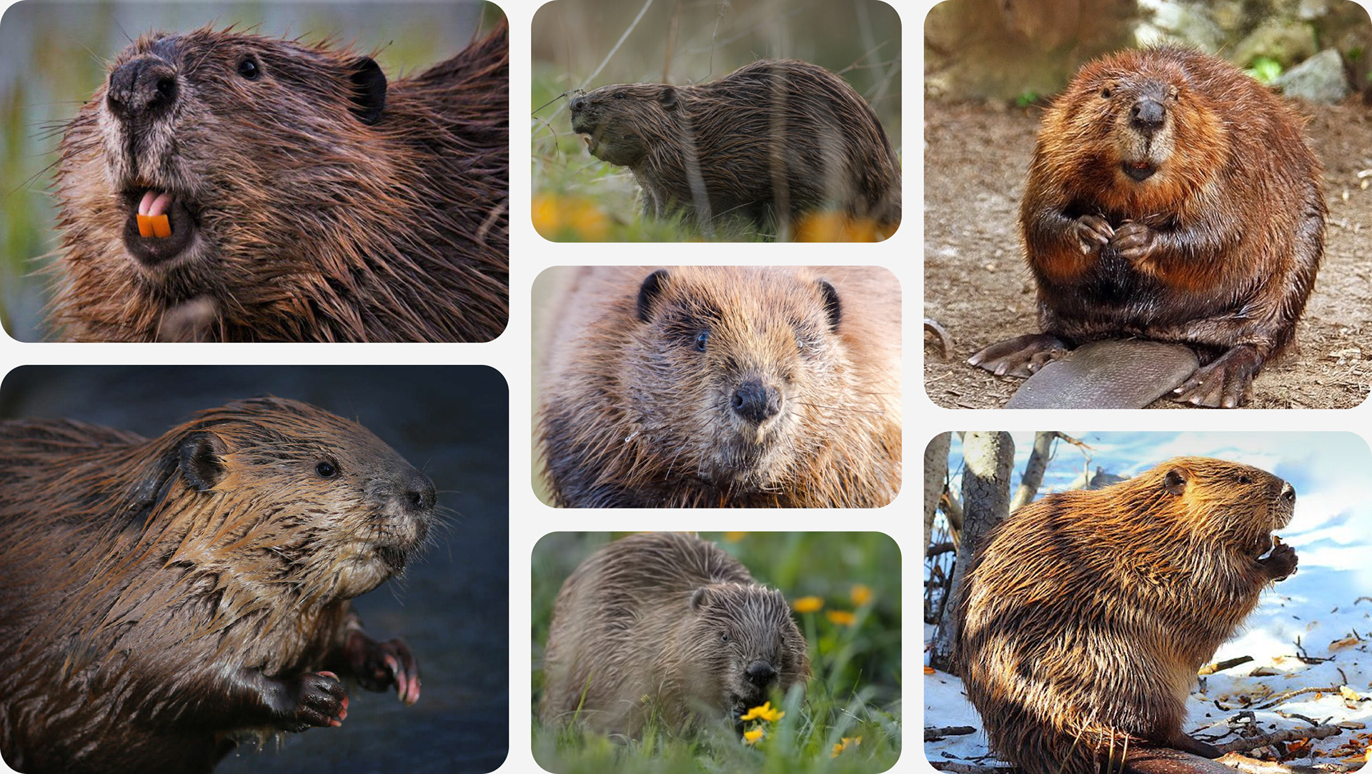
Moodboard 1
Real-life images of beavers, focusing on the features, behavior, and natural symbolism.
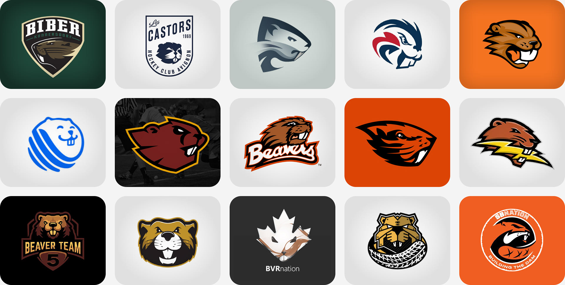
Moodboard 2
Illustrations and logo references that captured different visual styles.
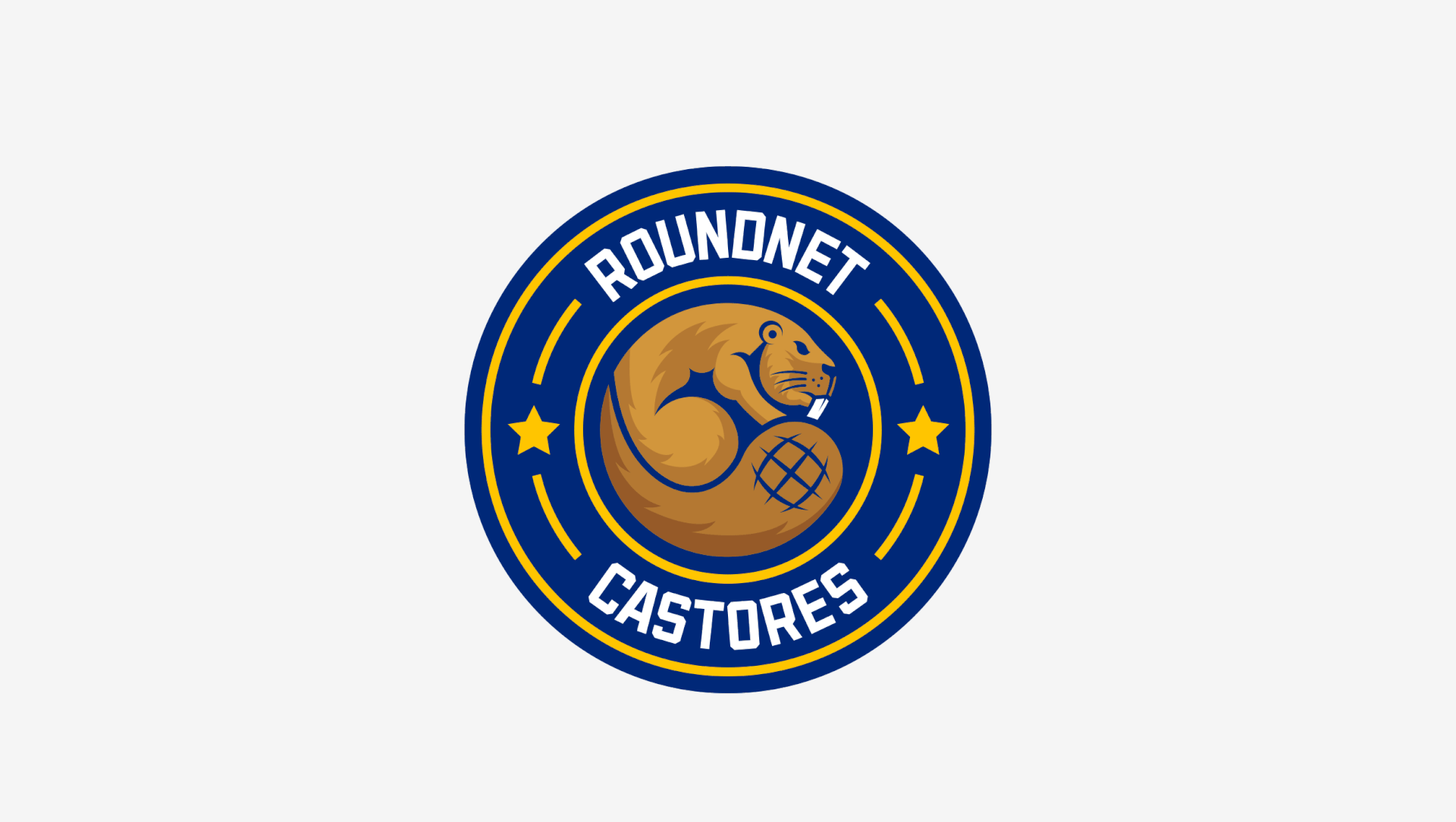
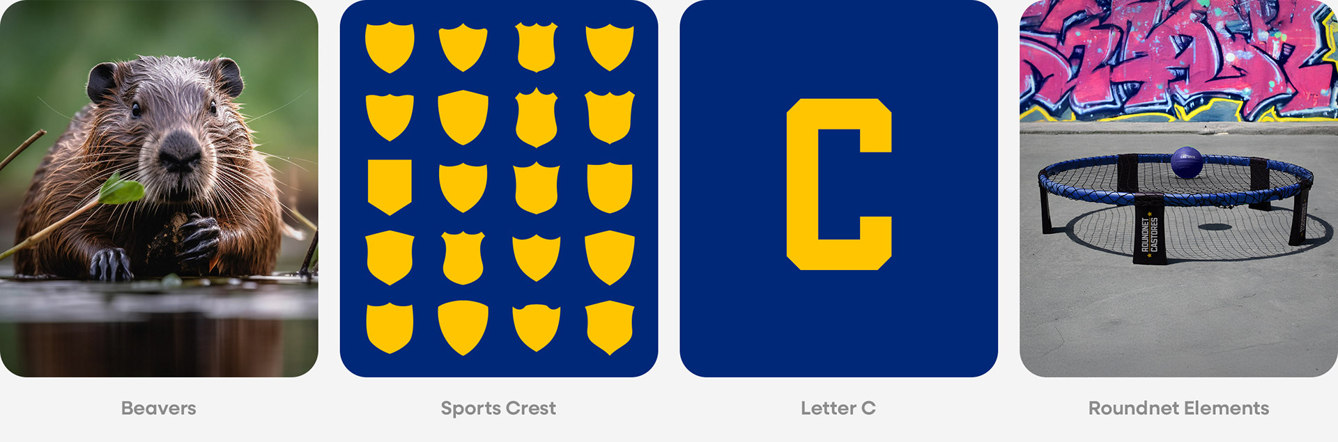
After exploring visual possibilities through the gathered references, I identified a strong creative direction: a beaver shaped like the letter “C” — a direct reference to “Castores”. After several sketches and refinements, I reached this final version:

With this final sketch, I used elements of Roundnet to shape the logo. So, I defined four key pillars that support the entire creative concept:
And this is the final version: